Stofradar
| Project Stofradar | |
|---|---|

| |
| Visualizing fine dust concentrations on a map | |
| Status | Initializing |
| Contact | bertrik |
| Last Update | 2018-06-10 |
Introduction
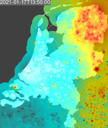
This page is about my plan to create a 'stofradar' image of fine dust concentrations based on the raw data measured by the luftdaten.info network.
luftdaten.info is an initiative to allow citizens to measure fine dust concentration using an inexpensive and easy to build fine dust sensor. They collect this data, calculate 5 minute and daily averages and publish it again as open data. The total number of sensors is about 5000 worldwide, most of them in germany, bulgaria, belgium, austria, sweden. The netherlands has about 100 sensors.
I want to create images / animations based on this data.
Visualisation
The general idea is to create an image, with a map at the background and the fine dust concentration overlaid on top.
TODO:
- get a nice background map, I prefer the equirectangular projection since that is easy to calculate. A black-and-white map would be nice so the overlay adds all the colour.
- find a way to combine the background with the dust concentration overlay: imagemagick composite?
- find a way to combine images over time into an animated gif: imagemagick convert?
Background map
Pages to investigate:
- https://wiki.openstreetmap.org/wiki/OSM_on_Paper
- http://maps.stamen.com/m2i/#toner-background/600:800/6/52.200/5.300
Interpolation
Since we only have data at a set of discrete points, the concentration at other points is estimated by combining data from all sensors using inverse distance weighting, in particular using the distance *squared* as the weighing factor in a weighted average. So a nearby sensor has a large effect and a far away sensor has very little effect only contributing a bit to the global average.
To calculate the distance, I use a very simple approximation:
- determine the difference in longitude and latitude
- apply an 'aspect ratio' factor of cos(latitude) to the longitude difference. I use the latitude of the approximate middle of the netherlands to calculate this aspect ratio factor.
- distance squared = (difference latitude)squared + (difference longitude)squared
A better way would be to use the 'great-circle-distance' and possibly even account for the fact that the earth is not perfectly spherical, but I think my approximation suffices and makes the calculation faster.
Colour range
The colours I'll probably be using (a kind of spectral range from red to blue):
- 0 ug/m3: fully transparent white (#FFFFFF.00)
- 25 ug/m3: quarter transparent cyan (#00FFFF.40)
- 50 ug/m3: quarter transparent yellow (#FFFF00.40)
- 100 ug/m3: quarter transparent red (#FF0000.40)
- 200 ug/m3 and higher: quarter transparent purple (#FF00FF.40)
With interpolation for RGB and alpha for values between these levels.
The level of 50 ug/m3 has been agreed on as the level that should not be exceeded as the yearly average in the Netherlands.
This scale is approximately logarithmic, with each step being twice as big as the previous one.
Compositing
I plan to use imagemagick for this.
Work in progress:
composite -compose over -geometry 800x600 20180605_210100.json.png netherlands.png output.png
where netherlands.png is an 600x800 opaque black-and-white image of the map of the netherlands and 20180605_210100.json.png is an 60x80 image of dust concentrations with an alpha channel