Stofradar
| Project Stofradar | |
|---|---|

| |
| Visualizing atmospheric particulate matter concentrations on a map | |
| Status | Completed |
| Contact | bertrik |
| Last Update | 2021-09-04 |
Introduction
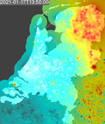
This page is about creating a 'stofradar' image of atmospheric particulate matter concentrations based on the raw data measured by the sensor.community network, see www.stofradar.nl.
The focus is on raw visualisation of the source data, only the most minimal attempt is made to "validate" the data. Sensor measurements and sensor locations are basically uncontrolled, since we cannot tell if a particular sensor is defective or has an unusual position that affects its measurements.
See also my DustSensor page.
The website sensor.community is an initiative to allow citizens to participate in measuring atmospheric particulate matter concentration using an inexpensive and easy to build sensor. They collect this data, calculate 5 minute and daily averages and publish it again as open data. The total number of sensors is > 10000 worldwide, most of them in Germany, Bulgaria, Belgium, Austria, Sweden. The Netherlands has > 1000 sensors. See also [1].
Future activities:
- find a universally agreed-upon color scale, and add a legend
- investigate why sometimes an image cannot be calculated (API not accessible?)
plot official luchtmeetnet measurements on the map too, access to the API has been implementedwork in progress
Visualisation
The general idea is to create an image, with a map at the background and the atmospheric particulate matter concentration overlaid on top.
Background map
What I need/want is to be able to specify the 'bounding box' and use a equirectangular projection , so I can easily map a pixel back to a latitude/longitude.
The equirectangular projection is contained in standard EPSG-32662
The map background on stofradar.nl is based on https://mapsvg.com/maps/netherlands
Interpolation
Since we only have data at a set of discrete points, the concentration at other points is estimated by combining data from all sensors using inverse distance weighting, in particular using the distance *squared* as the weighing factor in a weighted average. So a nearby sensor has a large effect and a far away sensor has very little effect, contributing only a little bit to the global average.
To calculate the distance, I use a very simple approximation:
- calculate the "middle" of the map (average latitude/longitude between top-left and bottom-right);
- calculate the "km-per-degree-latitude" at the middle for latitude as 40075 km / 360 degrees;
- calculate the "km-per-degree-longitude" at the middle for longitude as the number above multiplied with cos(latitude);
- determine the difference in longitude and the difference in latitude;
- convert both to km using the factors calculated earlier;
- calculate the euclidean distance.
A better way would be to use the 'great-circle-distance' and possibly even account for the fact that the earth is not perfectly spherical, but I like to start simple and this makes the calculation a lot faster.
Pixels that are not within a certain distance of any sensor station (e.g. 25 km) are rendered as grayscale, to indicate a geographic limit of each sensor.
Only sensors within a reasonable range of the map are taken into account, currently this is an area of 4 times (2x2) the visible area.
PM10 values < 0 ug/m3 are ignored in the software.
Colour range

The colours I'm using (a kind of inverted spectral range from blue to red):
- 0 ug/m3: fully transparent white (#FFFFFF)
- 25 ug/m3: semi-transparent cyan (#00FFFF)
- 50 ug/m3: semi-transparent yellow (#FFFF00). This is the threshold for the maximum daily average for PM10 in the Netherlands.
- 100 ug/m3: semi-transparent red (#FF0000)
- 200 ug/m3 and higher: semi-transparent purple (#FF00FF)
Values in between these levels are interpolated linearly with respect to the RGB colour value and alpha channel.
This scale is approximately logarithmic, with each step being twice as big as the previous one.
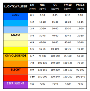
Scale used for Luchtmeetnet luchtkwaliteitsindex from RIVM:
https://www.luchtmeetnet.nl/informatie/luchtkwaliteit/luchtkwaliteitsindex-(lki)
Correction for high humidity
Humidity generally seems to cause an overestimation of PM measurements for measurements done with a "particle counting" type of PM sensor. The effect become really significant above approximately 70% humidity.
An interesting idea is to try to compensate for this effect, since the sensor.community sensor has an onboard humidity-sensor. Some papers/links about this:
- https://www.samenmetenaanluchtkwaliteit.nl/sites/default/files/2018-07/Status_SDS011_12juli18.pdf
- https://www.researchgate.net/publication/320474792_Influence_of_Humidity_on_the_Accuracy_of_Low-Cost_Particulate_Matter_Sensors
- https://github.com/opendata-stuttgart/meta/wiki/Luftfeuchte-Korrektur
However, I see the following problems with the formulas and coefficient in the opendata-stuttgart link above:
- it combines formulas and coefficients from different sources where relative humidity has different units. One paper seems to use an RH-value from 0 to 100, while another uses a kind of normalized relative humidity (from 0 to 1). You cannot just use the same coefficients if the unit is different.
- it claims a humidity correction for PM10 with coefficients that is not found in the source paper.
Compositing
I use imagemagick for this, for example:
composite -compose over -geometry 600x800 20180605_210100.json.png netherlands.png output.png
where netherlands.png is an 600x800 opaque black-and-white image of the map of the netherlands and 20180605_210100.json.png is an 60x80 image of dust concentrations with an alpha channel
Animation
The idea of animation is to combine several 5-minute images into a movie.
There are several options and file formats to choose from:
- GIF appears way too big, resulting in files of about 40 MB for 288 frames.
- APNG is only slighty smaller at about 37 MB.
- the webm format seems more suited, can be less than 1MB (lossy, VP9).
Example conversion command for webm:
cat ~/luftdatenmapper/tmp/netherlands/*.png |ffmpeg -f image2pipe -r 12 -i - -b:v 200k netherlands.webm
This results in an output file of about 650 kB.
Software
See the github page for the source code.